Rifuwo Energy Partners Brand Transformation
Role: Project Lead & Brand Implementation Designer – Led strategic naming and identity development, managed designer collaboration, designed brand application systems
Disciplines: Project Lead & Brand Implementation Designer – Led strategic naming and identity development, designed brand application systems
1. CONTEXT AND PROBLEM
Rifuwo Energy Partners operated in the increasingly crowded renewable energy investment sector, where differentiation was becoming critical. The existing brand name and identity failed to communicate their unique positioning or convey the credibility needed to attract investment partners and projects. The name “Rifuwo Energy Partners” lacked immediate clarity and memorability in a competitive market.
The renewable energy space was saturated with similar messaging—nearly every company claimed innovation, sustainability, and impact. Visual identities often defaulted to predictable green palettes, leaf imagery, and generic “eco” aesthetics that blended together. For an investment-focused company, this created a dual challenge: stand out from competitors while establishing the trust and professionalism that serious investors expect.
The client needed more than a logo refresh—they needed a complete brand transformation including a new name that would:
- Establish clear differentiation in a crowded sector
- Communicate their value proposition more effectively
- Balance innovation with investment credibility
- Work across all touchpoints from digital to corporate documentation
Without a distinctive brand identity and clearer name, Rifuwo Energy Partners risked being perceived as just another renewable energy company, making it harder to attract quality projects and investment partnerships.
2. CONSTRAINTS AND REALITY
Market Saturation
Renewable energy sector filled with similar messaging, green-focused visual identities, and generic sustainability positioning. Needed to break through established patterns.
Dual Audience Challenge
Brand had to appeal to two distinct audiences—environmentally-focused project developers AND financially-focused investors. Too “environmental” risks appearing uncommercial; too “corporate” loses the mission-driven appeal.
Brand Recognition Reset
Complete rebrand including new name meant starting brand awareness from zero. Every touchpoint needed to work harder to establish recognition and credibility quickly.
Limited Timeline
6-week project timeline required efficient process and clear decision-making. No room for extended exploration or multiple revision rounds. AI-assisted ideation became critical for compressing traditional naming timelines.
Implementation Scope
New identity needed to work immediately across multiple applications—digital presence, corporate documentation, pitch materials, and professional communications. Couldn’t launch with incomplete brand system.
Design Balance
Had to achieve visual distinctiveness without appearing trendy or lacking professionalism. Investment sector requires conservative credibility while renewable energy requires forward-thinking innovation.
3. ROLE AND SCOPE
Led complete brand transformation project from strategic naming through identity development and implementation.
Direct Ownership
- Project leadership and strategic direction
- AI-assisted naming ideation and brand messaging development
- Collaboration with designer on visual identity system
- Design and production of company profile (primary brand application)
- Brand system implementation and guidelines
Strategic Decisions
- Naming strategy and final name selection
- Brand positioning approach to balance innovation and credibility
- Use of AI tools to accelerate ideation process
- Visual direction within renewable energy sector conventions
- Application hierarchy and implementation priorities
Collaboration
- Worked with designer on corporate identity (CI) development
- Guided visual system to align with strategic positioning
- Ensured brand consistency across all touchpoints
4. SYSTEM-LEVEL SOLUTION
EXPERIENCE LAYER (What users saw and interacted with)
Brand Identity System
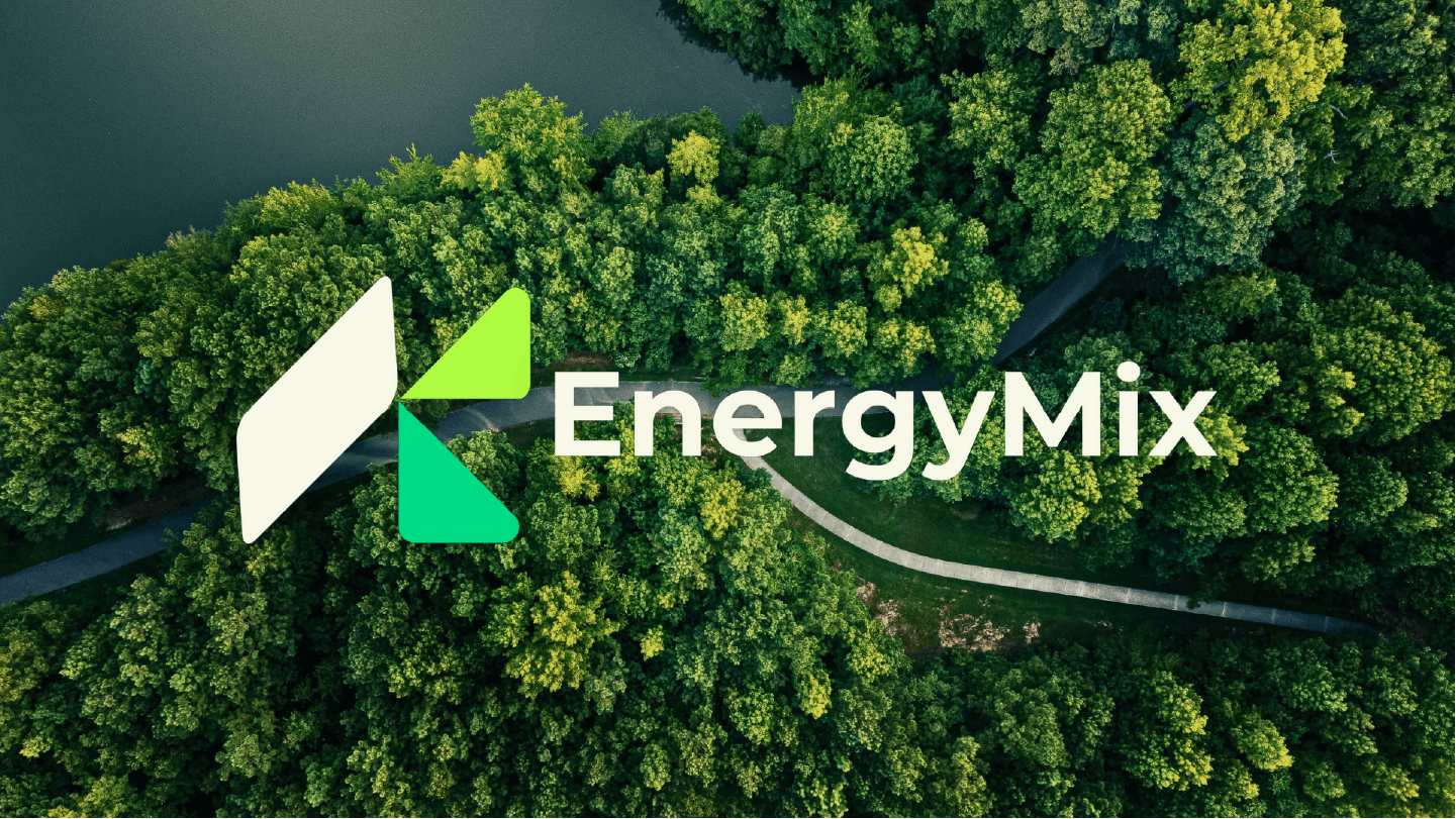
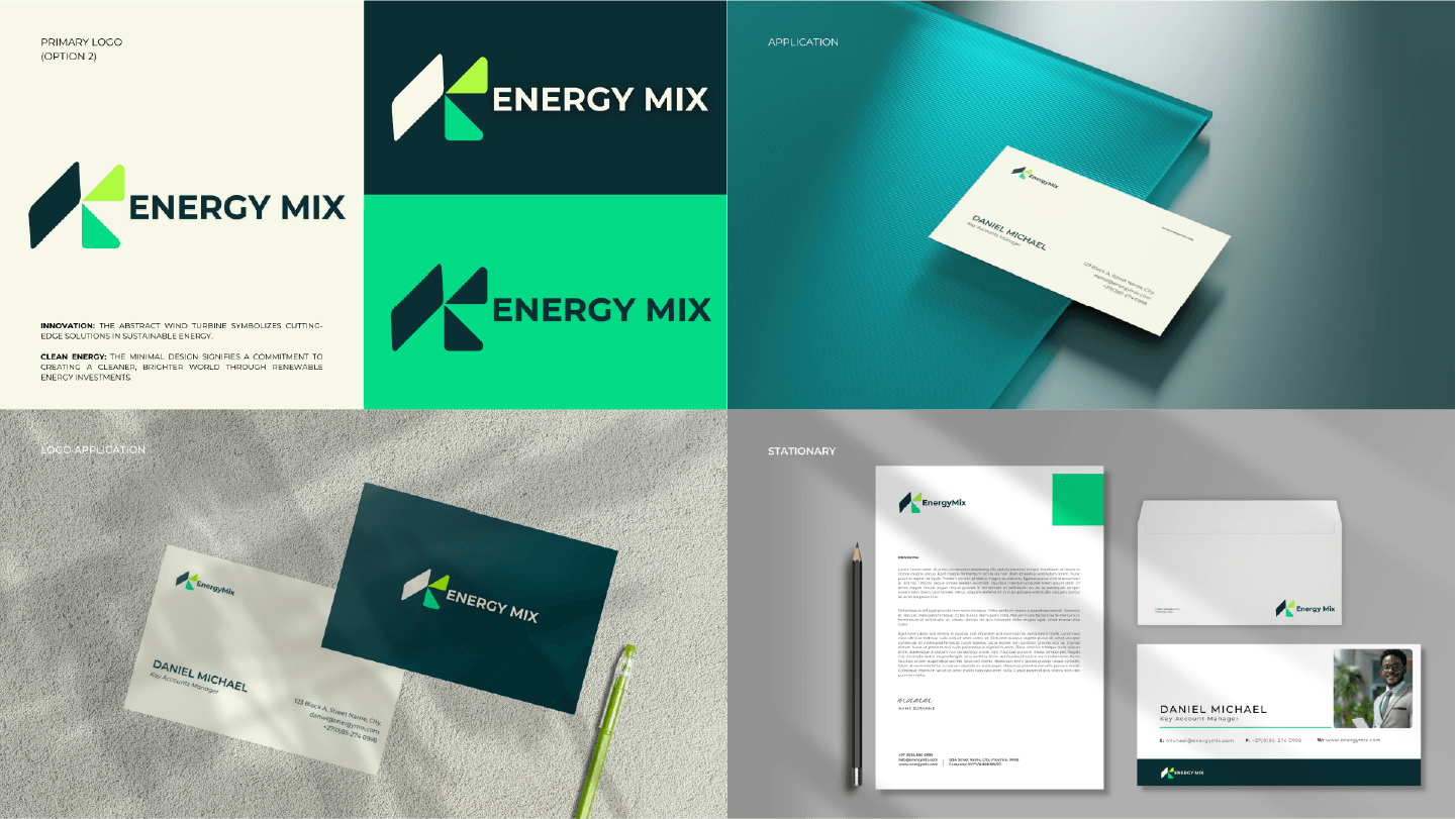
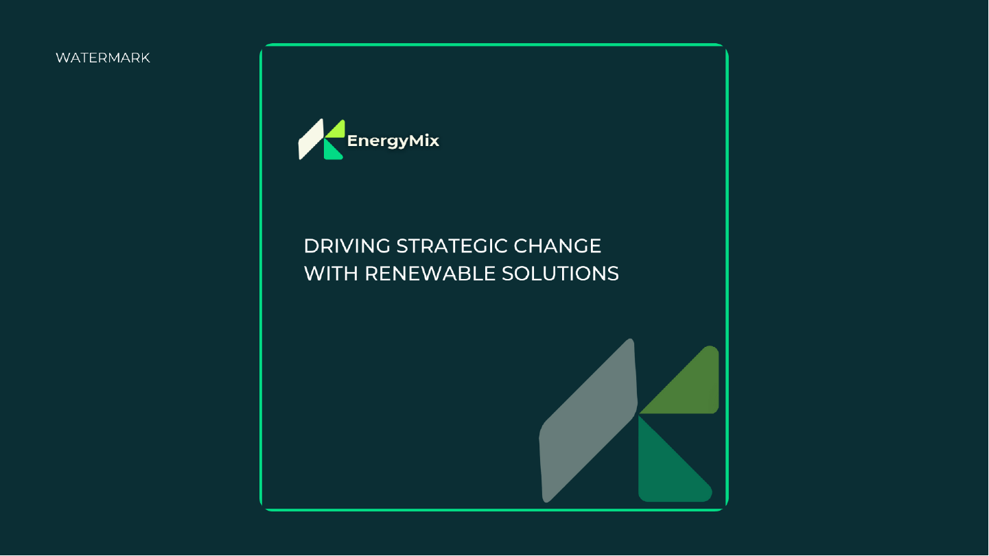
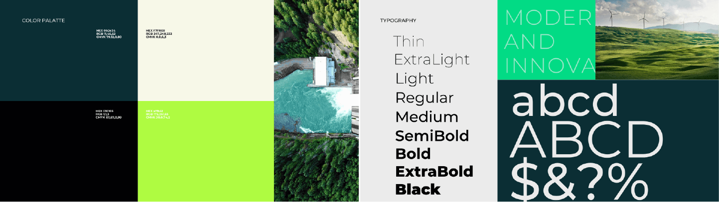
- New company name: “EnergyMix” (evolved from “Rifuwo Energy Partners”) – clearer communication of diverse renewable portfolio and energy sector expertise
- Visual identity balancing innovation (vibrant green) with professionalism (darker green accents)
- Minimalist design philosophy reflecting clarity and responsible investment
- Modern sans-serif typography communicating reliability and forward-thinking approach
- Color system: Vibrant green backdrop representing renewable commitment, darker green accents for depth and credibility
Brand Messaging Architecture
- Positioning that differentiates from generic “green energy” competitors
- Messaging emphasizing investment partnership and project enablement
- Tone balancing environmental mission with financial professionalism
- Clear value proposition for both project developers and investors
Brand Applications
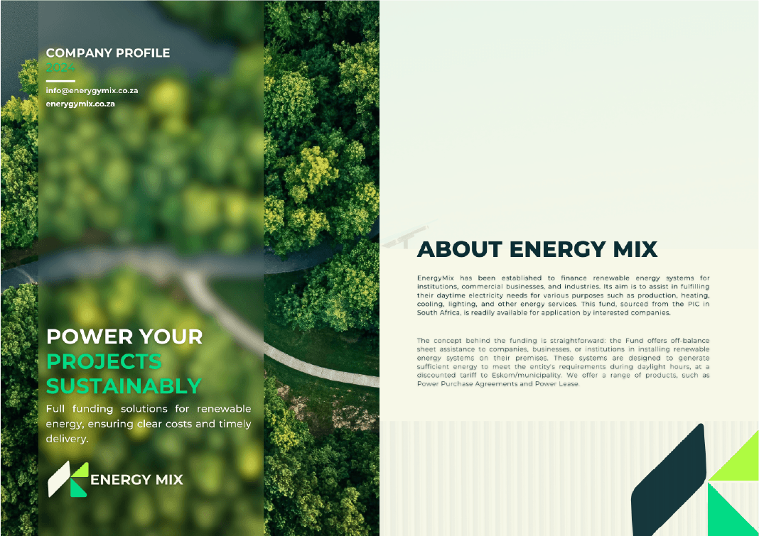
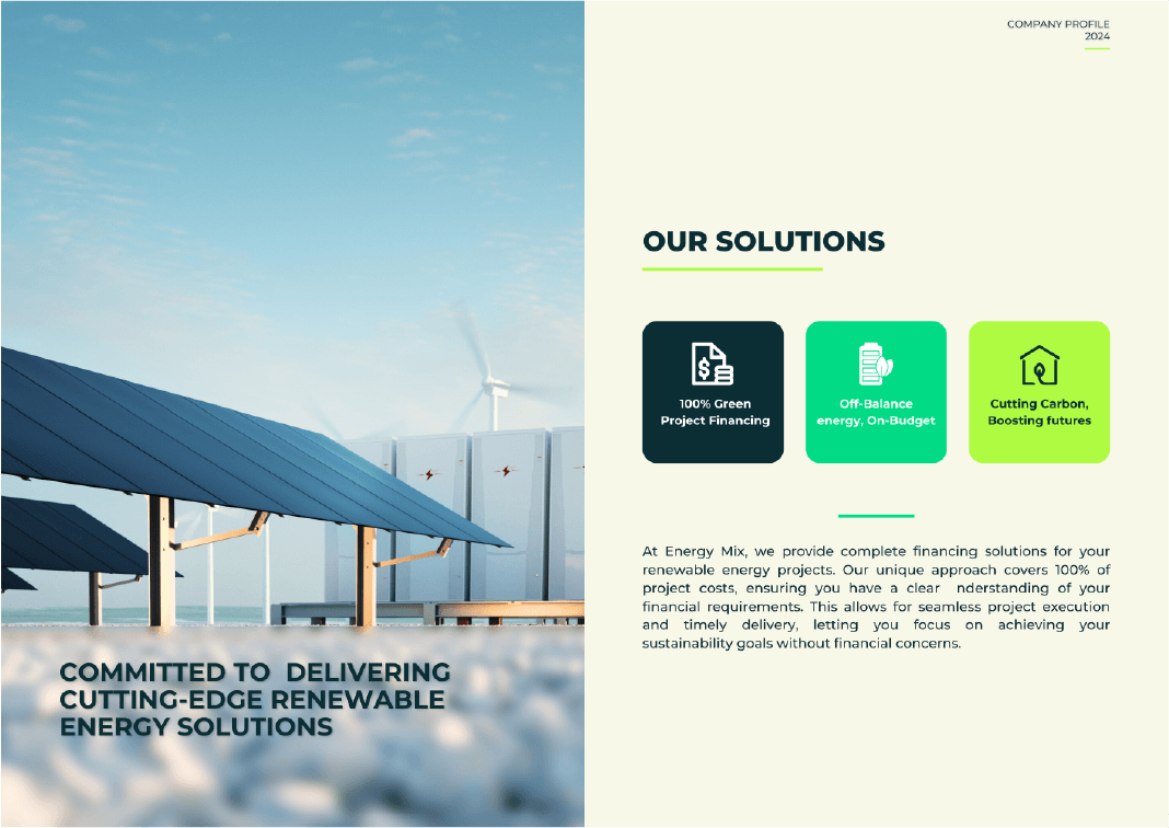
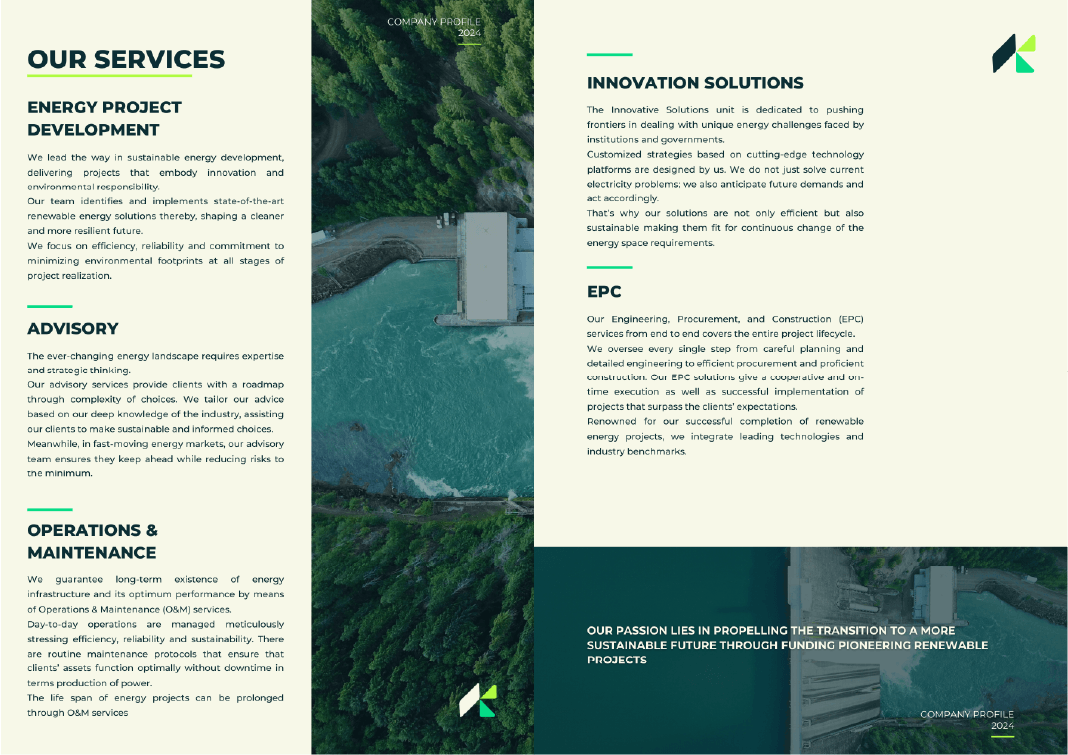
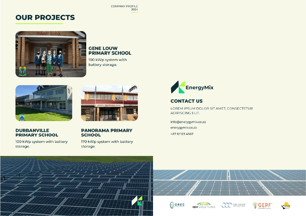
- Comprehensive 9-page company profile embodying complete CI system:
- Cover page establishing brand identity
- About section communicating company mission and positioning
- Solutions overview
- Services and Projects showcase
- Contact information
- Back cover maintaining brand consistency
- Professional documentation framework
- Corporate communications standards
- Scalable visual system for future applications
SYSTEM LAYER (How it was built and maintained)
AI-Accelerated Ideation Process
- Built WordPress platform with SEO-first architecture: semantic HTML, optimized meta tags, structured data
- Developed content strategy targeting tech-tourism conference keywords
- Continuously optimized based on search performance and competitor analysis over 8-month period
- Achieved organic ranking above established competitors through strategic content and technical SEO
Visual Identity Architecture
- Color system with clear hierarchy (primary vibrant green, accent darker green, supporting neutrals)
- Typography system establishing professionalism and modernity
- Design principles: minimalism, clarity, simplicity
- Scalable visual language that works across media and applications
Brand Guidelines Foundation
- Defined brand positioning and messaging framework
- Established visual identity rules and usage standards
- Created application examples through company profile design
- Built system that enables consistent future brand extensions

WORKFLOW LAYER (How the team operated)
AI-Enhanced Creative Process
- Integrated AI tools into traditional branding workflow
- Used AI for rapid ideation and concept exploration
- Maintained human creative direction and strategic decision-making
- Demonstrated how AI augments (not replaces) creative expertise
Collaborative Brand Development
- Led cross-functional process combining strategy, naming, and design
- Coordinated between strategic positioning and visual identity development
- Ensured alignment between brand concept and execution
- Managed designer collaboration to maintain strategic vision
Implementation Framework
- Designed form-based speaker detail collection system
- Automated image upload and data capture
- Set up automatic email notifications to team upon speaker submission
- Stored all speaker data in organized spreadsheet for easy access
- Removed friction from speaker onboarding process
5. DECISION LOGIC
Why complete rebrand with name change from "Rifuwo Energy Partners" to "EnergyMix"?
Original name “Rifuwo Energy Partners” lacked immediate clarity and was difficult to remember or communicate. The name didn’t convey what the company did or their unique value proposition. “EnergyMix” immediately communicates diverse renewable energy portfolio and sector expertise—it’s clearer, more memorable, and more descriptive. The name change signaled serious transformation and enabled fresh market positioning. A refresh of the old name wouldn’t solve the fundamental positioning and clarity problem. Starting with a stronger name foundation was strategic: better to build new recognizable brand than try to build awareness around unclear name.
Why ChatGPT-assisted ideation for naming and messaging?
Traditional naming processes take weeks of brainstorming and exploration. ChatGPT accelerated ideation phase by generating extensive naming options quickly—names that would have taken days or even weeks to develop manually. This reduced overall timeline by approximately 70%, allowing us to explore far more options and focus human creativity on evaluation and refinement rather than generation. Within 6-week project timeline, this efficiency was critical. This didn’t replace strategic thinking—it amplified it. We compressed timeline while improving quality through volume of exploration. Demonstrated modern, efficient approach to creative problem-solving.WordPress provided the right balance of flexibility, SEO capability, and team maintainability. WooCommerce offered robust e-commerce functionality specifically built for ticketing and events. Yoco integration was essential for local South African payment processing—supporting local payment methods delegates were familiar with. Alternative platforms (Webflow, custom build) either lacked native e-commerce or would have exceeded timeline and budget. WordPress’s plugin ecosystem enabled rapid implementation of needed functionality without custom development.
Why vibrant green + darker green accent system (not monochromatic or multi-colour)?
Needed to acknowledge sector conventions (green = renewable energy) while avoiding generic “eco brand” appearance. Vibrant green established energy and innovation; darker green accent added sophistication and investment credibility. Two-tone approach provided differentiation while remaining sector-appropriate. Rejected multi-color approaches that would appear less focused; rejected monochromatic that would appear flat and undifferentiated.
Why minimalist design philosophy over complex/decorative?
Minimalism communicated clarity, focus, and professionalism—critical for investment credibility. Complex design would distract from core message and risk appearing frivolous in financial context. “Simplicity and clarity of a cleaner world” positioning demanded visual restraint. Minimalism also ensured brand worked across all applications without losing impact or becoming cluttered.
Why modern sans-serif typography over serif or script?
Sans-serif communicated forward-thinking innovation and contemporary professionalism. Serif would appear traditional/conservative (wrong for renewable energy sector). Script would lack professionalism (wrong for investment context). Modern sans-serif balanced both audience needs—credible for investors, innovative for project developers.
Why is the company profile as the primary implementation focus?
Company profile serves as both client-facing collateral AND internal brand guidelines reference. It’s the highest-impact touchpoint for establishing credibility with investment partners and project developers. By designing a comprehensive 9-page profile first (Cover, About, Solutions, Services and Projects, Contact, Back Cover), we created the definitive expression of brand identity that would guide all future applications. This document does double duty: attracts business AND codifies the brand system. The profile development also allowed us to test the brand system across multiple content types and layouts, proving its flexibility through the 3 concept explorations before final selection.
Why human-led strategy with AI-augmented execution?
AI excels at volume and speed but lacks strategic judgment and sector understanding. We used AI for ideation velocity (naming options, messaging angles) while maintaining human leadership for strategic decisions (final name selection, positioning choices, visual direction). This hybrid approach delivered faster results without compromising quality or strategic coherence. Proved that AI is a tool for enhancement, not replacement.
6. OUTCOMES AND IMPACT
Brand Differentiation Achieved
- Created distinctive visual identity that stands apart from generic renewable energy branding
- Established clear positioning that differentiates from commodity “green energy” messaging
- Built brand system that works for dual audiences (investors + project developers)
- Enabled Rifuwo Energy Partners to compete on brand strength, not just service offerings
Implementation Foundation
- Designed comprehensive 9-page company profile embodying complete CI system (Cover, About, Solutions, Services and Projects, Contact, Back Cover)
- Created scalable brand framework for future applications
- Established visual and messaging consistency across all touchpoints
- Built system client team can apply independently to new materials
- Tested brand flexibility through 3 concept explorations before final selection
Speed & Efficiency Through AI
- Compressed traditional naming and messaging ideation timeline by 70% through ChatGPT-assisted brainstorming
- Generated and evaluated extensive naming options that would have taken days or weeks manually
- Delivered comprehensive brand transformation including name change within 6-week timeline
- Explored 3 design concepts efficiently within compressed schedule
- Demonstrated effective integration of AI tools into professional creative workflow
Professional Credibility
- Brand balances innovation and reliability effectively
- Visual system communicates both environmental commitment and investment professionalism
- Modern sans-serif typography establishes forward-thinking credibility
- Minimalist approach conveys focus and clarity
Client Satisfaction & Brand Acceptance
- Client expressed satisfaction with new “EnergyMix” brand identity
- Successfully transformed “Rifuwo Energy Partners” to clearer, more memorable brand
- Brand system worked effectively across 9-page company profile application
- Established foundation for consistent brand implementation going forward
System Reusability
- Proved ChatGPT-augmented creative process delivers 70% faster results without quality compromise
- Established workflow model for AI-assisted brand development
- Demonstrated strategic leadership in emerging creative technology application
- Created reusable approach for future branding projects
- Successfully managed 6-week timeline through efficient AI-enhanced ideation process

7. TRANSFORMATION TAKEAWAY
This project demonstrated that brand transformation isn’t just about visual design—it’s about strategic positioning made visible. The real challenge wasn’t choosing colors or fonts; it was differentiating in a crowded sector while balancing dual audience needs.
The integration of ChatGPT into the creative process proved transformative. By using AI for rapid ideation, we compressed weeks of traditional brainstorming into a fraction of the time—achieving 70% time savings while exploring naming options that would have taken days or weeks manually. Within a 6-week project timeline, this efficiency was critical. This isn’t about AI replacing creative thinking—it’s about AI augmenting human strategic judgment. The technology handled volume and speed; humans handled strategy, taste, and sector understanding.
Key reusable insight:
When facing crowded market positioning, the answer isn’t “try harder at differentiation”—it’s understanding the conventions, then making intentional choices about which to honor and which to break. The name change from “Rifuwo Energy Partners” to “EnergyMix” exemplified this: we honored renewable energy sector expectations (green palette, clear sector identification) while subverting generic “eco brand” clichés (minimalism, two-tone sophistication, investment credibility). The new name itself provided immediate clarity that the old name lacked.
The minimalist approach worked because it aligned visual restraint with brand strategy—clarity and simplicity reinforced the core message. Every design decision supported the positioning, not just aesthetic preference.
The framework that made this work:
- Use AI to accelerate ideation, not replace strategic thinking
- Understand sector conventions before attempting differentiation
- Design for dual audiences by finding visual language that bridges both
- Make implementation the proof point—apply brand system to highest-impact touchpoint first
- Create systems, not just deliverables—brand guidelines embedded in company profile
This approach is reusable for any brand transformation where speed, strategic positioning, and dual-audience appeal are critical. The AI-augmented workflow alone is applicable to naming, messaging, content development, and strategic exploration across industries.
The 9-page company profile design wasn’t just “applying the brand”—it was proving the brand system worked in real-world application while creating the reference document for future consistency. Testing 3 concept explorations ensured we arrived at the strongest solution within the 6-week timeline.